
Binder charts your whole collection, or any single card, across 1M, 3M, 1Y, and all-time windows, with your cost basis line layered on top so profit and loss is one tap away. Every point is a real daily snapshot from comparable sales, not an estimate, and a P&L tab breaks gains down per card and set.
- Charts total binder value or a single card's exact variant and grade across 1M, 3M, 1Y, and all-time.
- Cost basis overlay (Pro) and a P&L tab show realized and unrealized gains per card, per set, and across the whole binder.
- Every chart point is a real daily snapshot from comparable sales, not an interpolation.
- Chart any slice, such as Base Set holos, graded cards, or cards bought in a given year, each with its own line and cost basis.
- Low-volume vintage periods get flagged rather than smoothed over, since thin sales cannot draw a clean curve.
What you see on the chart
The default view is a line chart of your total binder value over time. Tap into a single card and the chart switches to the price history for that exact variant and grade. The data on the chart is real: every point is a daily snapshot pulled from comparable sales, not an interpolation or estimate.
- Total binder value with cost basis overlay (Pro).
- Per-card price history across PSA grades, raw, and other graders.
- 1M, 3M, 1Y, and all-time time windows.
- Tap the chart to see the exact comp that set the snapshot.
Cost basis and P&L
When you add a card, Binder asks for what you paid. That number flows into the P&L view: a separate tab that shows realized and unrealized gains per card, per set, and across the whole binder. Tax season for collectors is a real thing, and the P&L view is the part that survives an audit.
Subsets and grouping
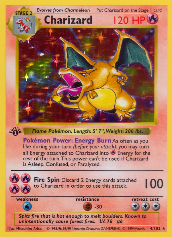
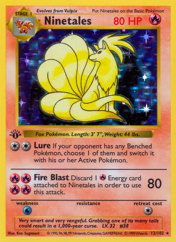
You can chart any slice. Show me just my Base Set holos. Show me just my graded cards. Show me just the cards I bought in 2024. Each subset gets its own line and its own cost basis, so you can see which corner of your binder is actually moving and which one you are paying storage on.
The honest limit
A portfolio chart is only as good as the underlying prices. For modern cards, the comp pool is deep and the chart is reliable. For low-population vintage variants. 1st Edition error prints, rare graded shifts. There are not always enough sales to draw a clean curve. The app flags low-volume periods rather than smoothing over them.